ABOUT
ABOUT
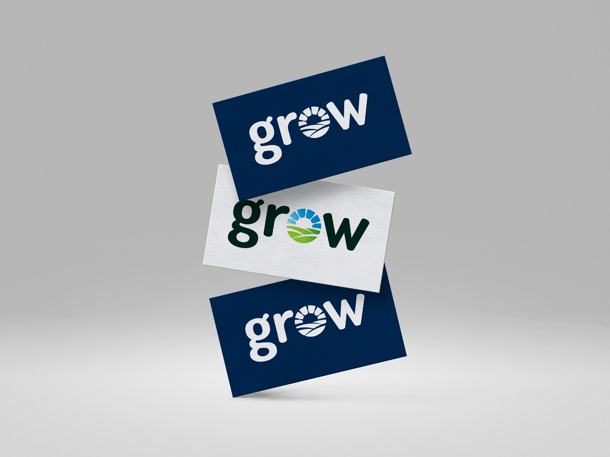
Translating GROW’s existing identity into a website for farmers and agricultural innovators. My work focused on the interface, visual hierarchy and graphic elements that make the programme’s information easier to explore.
my
my
role
role
I designed the website’s visual language and user experience, working with the programme team from wireframes to the final interface. The established GROW identity guided the logo use, colours and typography.
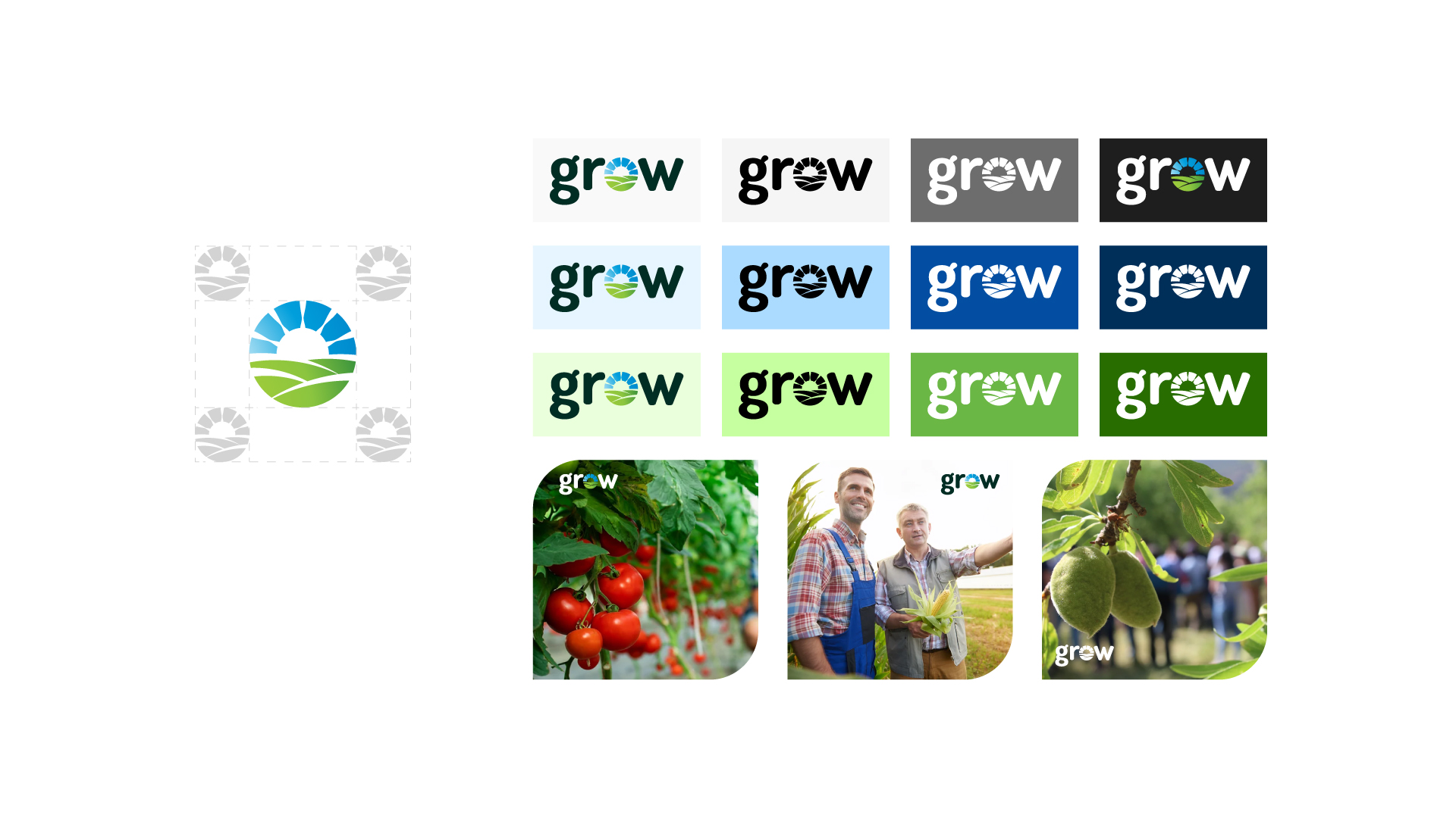
The design uses GROW’s blue and green palette with Dosis and Titillium typography. I applied those foundations consistently across page layouts and graphic elements, keeping the project recognisable throughout the site.

design
design
Materials
Materials
- Website wireframes and interface design
- Brand application across digital layouts
- Typography and colour system
- Responsive page layouts and graphic elements
Have a brand or design project in mind? Let’s talk.
Need a consistent identity across your materials? Explore my branding and graphic design service.

.png)