Forms That Ask Less and Explain More
A contact form is often the point where a website stops presenting itself and asks a visitor to do some work. That work should have a reason.
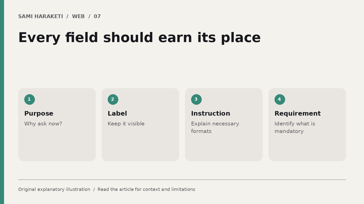
Every field creates a question: why do you need this information now If you cannot answer it, consider whether the field belongs in the first enquiry.
Give each question a purpose
For a design enquiry, the initial essentials might be a way to respond and a brief description of the project. Other details can be useful, but usefulness does not automatically mean they must be required.
W3C's forms tutorials emphasise labels, instructions and understandable feedback. A placeholder is not a reliable replacement for a visible label: it can disappear as the person types.
Explain required fields clearly. If a format is necessary, communicate it before an error occurs. Keep instructions close enough to the field to remain understandable.
The visual layout should support the sequence. A clever arrangement that makes people search for the next question has added difficulty at the moment you want the conversation to begin.
Write errors as practical help
Suppose someone submits an enquiry without an email address. “Invalid submission” tells them almost nothing. An error that identifies the email field and explains what is needed gives them a route forward.
Do not make colour the only indication of an error. Associate the message with the relevant field and provide a clear way to find errors in a longer form. W3C's notification guidance discusses error summaries and specific corrective messages.
Preserve the information already entered wherever possible. Asking someone to rewrite a thoughtful project description because another field failed is an avoidable frustration.
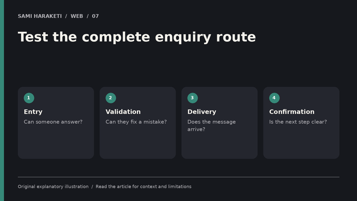
Test incomplete input, unexpected characters and a long message. Also inspect what happens when the network fails or the submission takes time. Does the interface explain the state without encouraging duplicate submissions
These are proposed tests for the implementation. A polished form screenshot cannot show whether its messages arrive or whether a failure is handled sensibly.
Finish the conversation's first step
A useful confirmation states what happened and what comes next. If the message was sent, say so. Do not promise a response time you cannot support.
Check the receiving end. Who gets the enquiry Is the message complete Does the reply address work If an external form service is involved, understand its limits and how submitted information is handled.
For a small website, I would keep a simple review record: successful enquiry, failed validation, delivery check and mobile keyboard behaviour. Repeat the relevant checks after changes to the form or notification setup.
Keep the tone consistent with the website. Clear can still be warm. “Tell me a little about the project” may suit a personal studio better than a heavily formal application, provided the field still has an understandable label.
A form does not need to extract every detail a future proposal might require. It needs to make the first useful exchange easy and give both sides enough information to continue.
When you design it that way, the form feels like part of the service rather than a final obstacle placed between a visitor and a person.
Sources and further reading
Research checked on October 5, 2026. Original explanatory illustrations by Sami Haraketi, prepared for this article.
Sources and further reading
Research checked on October 5, 2026. Original explanatory illustrations by Sami Haraketi, prepared for this article.
Have a project behind the idea?
I work on websites, branding and film. If you need help turning your next idea into something people can see and use, tell me what you have in mind.
What did you think?
A thought, a different perspective, a little appreciation. You’re welcome here.