Grid and Flexbox: Two Different Layout Problems
Grid and Flexbox can sometimes produce a similar screenshot. That does not mean they describe the same layout decision.
I find the choice easier when I stop asking which one is more advanced and ask how the items need to relate to each other.
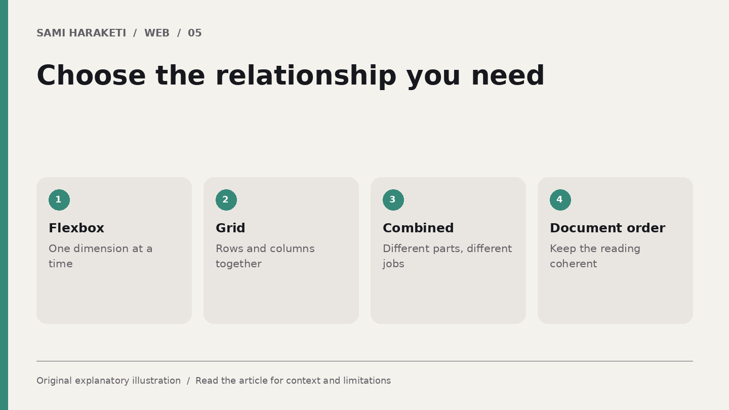
One direction or coordinated rows and columns
MDN describes Flexbox as a layout method that works in one dimension at a time, arranging items along a row or column. CSS Grid manages rows and columns together.
Flexbox is often useful when content needs to distribute itself along one direction. Grid is often useful when alignment across rows and columns forms part of the design.
Both can wrap or adapt, and real pages commonly use both. A grid of project cards may contain a flex layout inside each card. The decision belongs to the relationship you want, not to a rule that one technique should build the entire site.
Also separate visual arrangement from document order. A layout tool can reposition items without changing the order in which other ways of navigating encounter them.
Examine two ordinary components
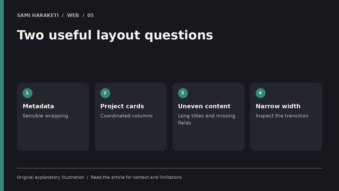
Imagine a fictional article header with an author name, publication date and reading duration. The items need to sit together, wrap when space is limited and remain readable in their natural sequence. A Flexbox arrangement may be a useful fit.
Now imagine a project index where cards should align in coordinated columns across multiple rows. A Grid arrangement may express that relationship more directly.
Put uneven content into both examples. Give one project a long title and another a short one. Add a missing optional description. Narrow the viewport until wrapping occurs.
With wrapped flex lines, each line distributes its items according to the flex layout rules. You should not assume it will create the same aligned column relationships as a grid. If those relationships matter, make them explicit.
For the article metadata, avoid making every item the same width merely to produce a neat screenshot. The useful requirement may be readable spacing and sensible wrapping, not a rigid table.
Make the layout resilient
Choose how the component should behave when there is less room, more content or an unexpected combination of fields. Test minimum and maximum realistic examples from the CMS.
Check the order with a keyboard when interactive items are involved. A visually reordered card should not cause focus to jump through a confusing sequence. Keep the underlying reading order coherent wherever possible.
I would also inspect empty states. If a project has no category label, does the layout leave an unexplained gap If an author name is long, does it push the reading time outside the header
For maintenance, name the purpose of the layout in the component notes. “Coordinated project columns” and “wrapping article metadata” describe decisions another designer can understand.
Grid and Flexbox are useful precisely because they express different relationships without making you position every item by hand. The better choice is the one that describes the component clearly and remains understandable when the content changes.
A layout that only works for its sample text is unfinished. A layout that survives real content lets the design keep its shape while the website continues to grow.
Sources and further reading
Research checked on October 5, 2026. Original explanatory illustrations by Sami Haraketi, prepared for this article.
Sources and further reading
Research checked on October 5, 2026. Original explanatory illustrations by Sami Haraketi, prepared for this article.
Have a project behind the idea?
I work on websites, branding and film. If you need help turning your next idea into something people can see and use, tell me what you have in mind.
What did you think?
A thought, a different perspective, a little appreciation. You’re welcome here.