Accessibility Is Part of the Design
A website is not finished because it works for the person who designed it. People arrive with different ways of seeing, reading, moving and interacting.
Accessibility belongs inside those design decisions. It changes the names we give controls, the contrast we choose and the way a page behaves when someone uses a keyboard.
Begin with an actual task
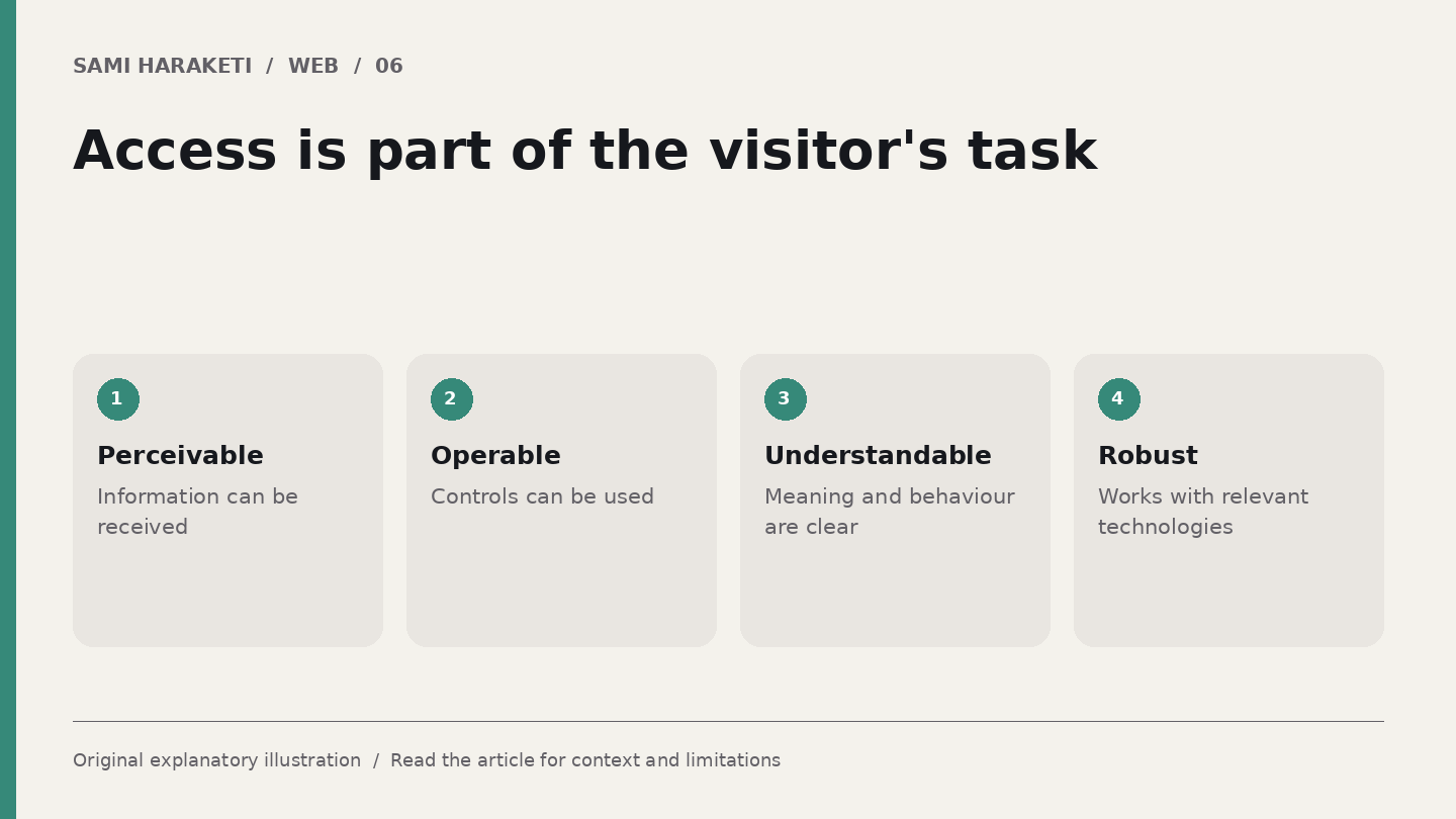
W3C organises accessibility principles around content being perceivable, operable, understandable and robust. Its WCAG guidelines provide criteria for assessment. They are more useful than a vague promise that a site is accessible.
For text contrast, WCAG 2.2's AA criterion generally specifies at least 4.5 to 1, with 3 to 1 for large text and defined exceptions. Size alone does not make every pale heading acceptable.
Keyboard operation and visible focus also matter. A person needs to know which control is active and be able to complete the relevant task. A sticky overlay can create a problem even when the underlying button has a focus style.
A preliminary check is useful, but it is not equivalent to a complete accessibility evaluation.
Follow the visitor through the page
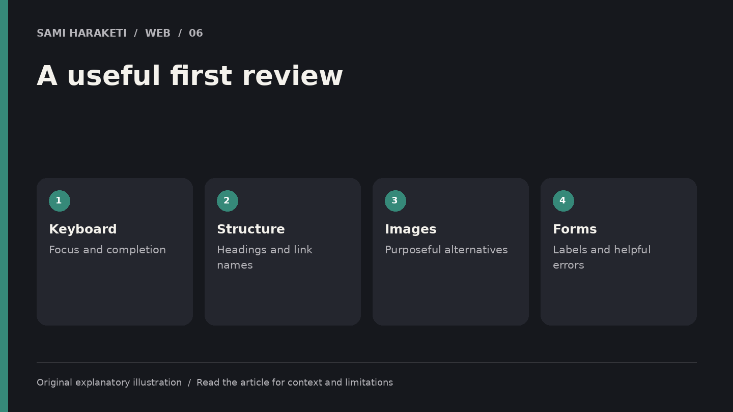
Choose an ordinary task: find a service, inspect a project and send an enquiry. Complete it with a keyboard. Notice whether the focus order makes sense, menus can be used and controls explain their purpose.
Next, inspect the heading structure and names of links. A screen reader user should not have to guess which of six identical labels leads to the desired project.
Review images in context. An informative image needs a text alternative that communicates its relevant meaning. A purely decorative image should not burden the reader with an unnecessary description. The right treatment depends on its job on that page.
Try the contact form. Are labels visible and associated with their fields Does an error explain what needs fixing Can the person retain what they already entered
Finally, enlarge the text and narrow the viewport. Look for clipped content and controls that disappear. These checks inspect the experience; an automated report alone cannot describe all of it.
Protect the design's useful qualities
Accessibility does not require removing personality. You can keep a restrained type system, a generous layout and expressive imagery while making the structure and interaction clearer.
I would fix repeated components early. A navigation menu or form used across the site can carry the same barrier onto many pages. Improving it helps more than correcting a single isolated instance.
Keep a record of what was assessed, what remains unresolved and which content examples were used. Include people with relevant access needs where possible, especially for complex interactions. Their experience can reveal problems a checklist misses.
Do not announce complete conformance from a quick tool scan. Report the actual scope of your assessment. That is more useful for maintenance and more honest with the people relying on the site.
If a visual effect prevents someone from completing the task, reconsider the effect. The design's purpose includes access to the work.
I want a website to feel considered from the first impression to the last form field. Accessibility is part of that care, and it needs to survive the real conditions in which people encounter the page.
Sources and further reading
Research checked on October 5, 2026. Original explanatory illustrations by Sami Haraketi, prepared for this article.
Sources and further reading
Research checked on October 5, 2026. Original explanatory illustrations by Sami Haraketi, prepared for this article.
Have a project behind the idea?
I work on websites, branding and film. If you need help turning your next idea into something people can see and use, tell me what you have in mind.
What did you think?
A thought, a different perspective, a little appreciation. You’re welcome here.