Google’s Material 3 Expressive: Finally, a UI That Doesn’t Make You Feel Dumb
Alright, let’s get real.
We’ve all opened an app and had that “what am I even supposed to press?” moment. Buttons too small, icons that look like abstract art, and menus buried under more menus. And if you’ve ever watched your parents try to navigate their phones, you know it gets worse.
But in 2025, Google finally did something smart—they stopped designing for trends and started designing for humans.
They called it Material 3 Expressive, and it’s not just another pretty interface. It’s Google going, “Wait… should this actually be usable?” Spoiler alert: yes.
🧠 What Makes It Different? Testing. Lots of It.
This isn’t your average design refresh with a splash of pastel and some smooth corners. Nope. This thing was tested like it was going to space.
- 46 rounds of user testing
- 18,000+ participants
- A massive focus on people who usually get ignored in design: folks over 45
Let that sink in. Google actually asked people—a lot of people—what worked and what didn’t. Then they used that feedback to fix the stuff that annoys all of us.
One of the biggest wins? After the update, users over 45 could find stuff on-screen just as fast as 18-year-olds. That’s wild.
And it gets better: task completion times across all ages? Up to 4× faster. Yeah, four.
💡 So… What Did They Actually Change?
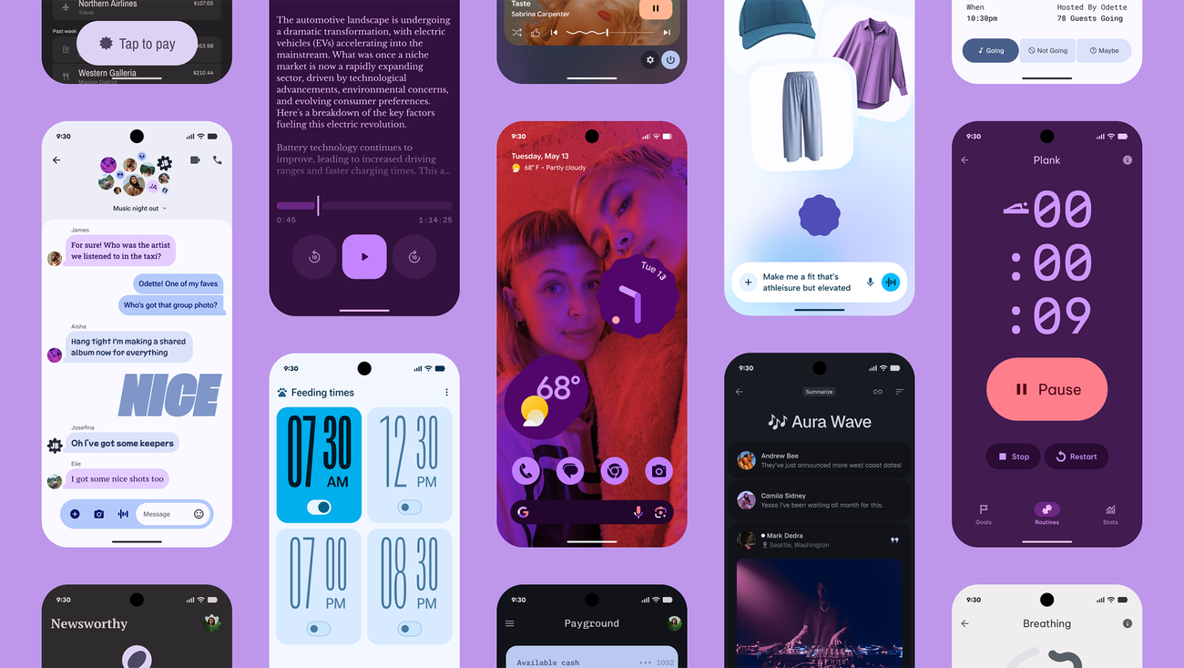
Here’s the short version: they made everything easier to see, easier to understand, and easier to tap.
- Bigger touch targets. You no longer need a surgeon’s hand to hit the right button.
- Better icon design. Finally, icons that look like what they’re supposed to represent.
- Improved layouts. Less clutter. More clarity.
- More expressive visuals. It’s not just gray-on-gray anymore—there’s actual life in this UI.
- More emotional, intuitive color palettes. It feels friendly instead of robotic.
Basically, it’s like Google gave Android a cup of coffee and a therapist. It's awake now, and it knows how to treat people.
🔍 What Makes This a Big Deal?
Because this update isn't just "nice"—it's important.
It shows that design isn't about being sleek. It's about being understandable. Google decided to stop making UIs that win awards and start making UIs that make sense.
More than that, it’s proof that good design is inclusive design. That means designing for everyone—yes, even people with slower reflexes, vision issues, or zero patience for buried settings.
And when you build like that? Everyone benefits.
🤔 What Can We Learn From This?
If you're a designer, developer, or anyone who’s ever shipped a digital product, this update is kind of a wake-up call.
Design isn’t just about how things look. It’s about how things work. And more importantly, how they work for everyone, not just tech bros and design nerds.
Material 3 Expressive is Google saying, “We listened. We learned. And we stopped assuming everyone’s 23 and using a Pixel in perfect lighting.”
📚 Sources (Because This Isn’t Just Vibes)
- Google Material Design Team – Official M3 Expressive research
- The Verge – Leak: Google’s new design language
- Times of India Tech – What’s changing in Material 3 Expressive
- Material.io – Google’s official design guidelines
- r/graphic_design – Designers reacting to early previews and beta leaks


More
more
like this
like this
On this blog, I write about what I love: AI, web design, graphic design, SEO, tech, and cinema, with a personal twist.