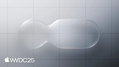
Apple’s Liquid Glass UI
At WWDC 2025, Apple did something bold: it melted the edges of the screen, metaphorically, of course, and introduced what it’s calling the “Liquid Glass” UI.
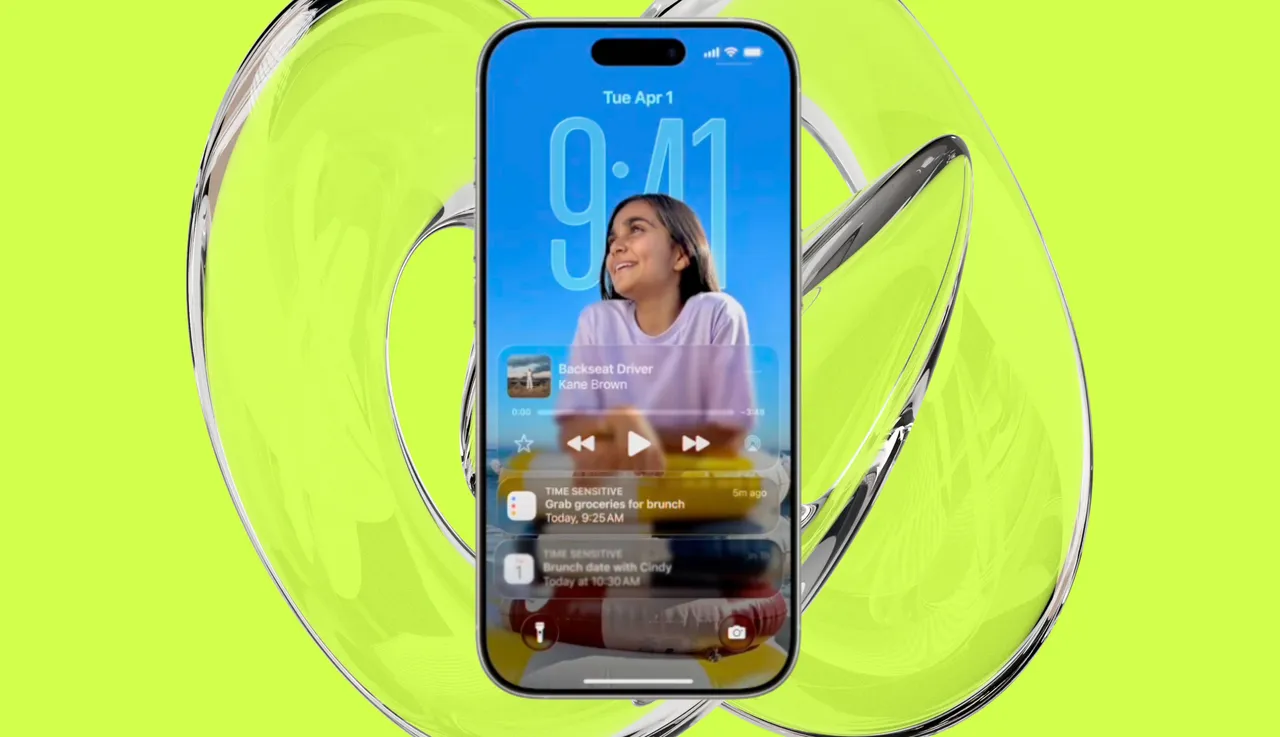
Gone are the flat, rigid designs of past iOS versions. In their place: translucent, fluid, motion-driven interfaces that adapt, breathe, and feel almost alive. But this isn’t just about aesthetics. It’s a major shift in how we think about digital experience design.
Let’s break down what it is, why it matters, and what it means for designers and users alike.
💡 What Is Liquid Glass?
Think of Liquid Glass as the spiritual successor to Apple’s earlier skeuomorphism and the polished minimalism of iOS 7+. But now, it's fluid, reactive, and dimensional, built on several key principles:
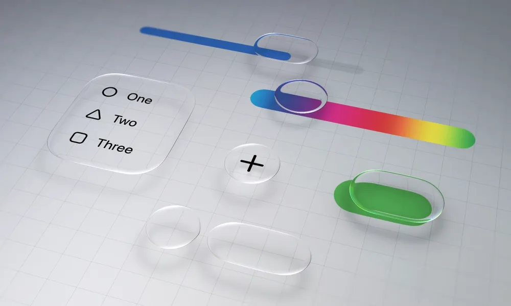
- Translucency & Blur Layers: Menus and modals are now semi-transparent, allowing background content to subtly bleed through.
- Dynamic Light Behavior: UI elements respond to ambient lighting and user motion.
- Motion as Feedback: Navigation, scrolling, and haptics work together to create a soft, touch-responsive environment.
- Glassmorphism 2.0: Building on the frosted-glass look made popular in macOS Big Sur, now reimagined with more depth, shadow, and context awareness.
In a nutshell: Apple is making the UI feel less like a screen and more like an interface that lives inside physical space.
🧠 Why Is Apple Doing This?
Tim Cook described Liquid Glass as “design that responds not just to touch, but to presence.” That may sound poetic, but it’s grounded in real strategy:
1. Vision Pro & Spatial Computing
Apple’s push into spatial interfaces (Vision Pro, visionOS) means UI can no longer be flat. Liquid Glass is a stepping stone—training users’ eyes and fingers for fluid, spatial design.
2. Consistency Across Platforms
Whether on iPhone, iPad, or Vision Pro, Apple wants one visual language. Liquid Glass unifies the brand while optimizing for gesture-based, immersive input.
3. Emotional Connection
Studies show users perceive motion-rich, translucent UIs as more premium and trustworthy. Apple, always about the “feel,” is leveraging this to deepen user connection.
“This is Apple putting emotion back into the interface.” — John Maeda, technologist and former head of computational design at MIT Media Lab
📊 By the Numbers
- 58% of WWDC attendee survey respondents said Liquid Glass felt “more intuitive” than iOS 17’s design.
- Apple claims UI responsiveness improved by 30%, thanks to more efficient rendering pipelines and tighter Metal GPU integrations.
- Over 1,000 micro-interaction refinements were added to enhance feel—think corner tucks, hover swells, and dynamic shadows.
- Developers saw an 18% increase in user engagement in early beta tests with Liquid Glass-enabled apps.
🎨 What This Means for Designers
This is not just a visual refresh — it’s a new design paradigm.
✦ Embrace Layering
Design with depth in mind. Think: glass cards floating above dynamic backgrounds. Contrast, color, and motion all matter more now.
✦ Animate with Purpose
Motion isn’t for flair anymore — it signals hierarchy, attention, and even urgency.
✦ Build for Ambient Context
Color palettes need to shift in real-time. Your designs must respond to light mode, dark mode, and even motion/lighting conditions around the user.
✦ Accessibility Is Non-Negotiable
Apple is adding more motion-reduction and contrast-enhancement options than ever. If your designs aren’t readable with blur or motion turned off, they’ll fail.
🧭 Where It’s Going
Apple’s Liquid Glass UI may just be version 1.0 of a screenless future. By blending UI with spatial context and reactive behaviors, it’s creating a design language for:
- AR/VR headsets
- Spatial apps and holographic displays
- AI-driven, assistive UIs that respond before you touch
This could be the beginning of an interface evolution—from rigid screens to adaptive, fluid experiences that feel more like part of our world than stuck behind a display.
📌 Final Thought
Apple didn’t just change how iOS looks. With Liquid Glass, it’s reshaping how we feel while interacting with tech.
And as the lines blur—literally and figuratively—between real and digital, the goal is clear: interfaces should disappear into the experience.
📚 Sources & References
- Apple WWDC 2025 Keynote
- Inside the Launch of Liquid Glass, GQ
- The Verge – Figma and Apple UI Trends
- Apple Developer Documentation on UI Kits (June 2025)
- Interview with John Maeda, Design Futures 2025


More
more
like this
like this
On this blog, I write about what I love: AI, web design, graphic design, SEO, tech, and cinema, with a personal twist.