Is the Flat Design Era Over? Spotify's 3D Logo and Google's Gradient Reboot Signal a Major Shift
For years, flat design has been the quiet, reliable visual language of the digital world. Its hallmark was the elimination of anything that didn't serve a pure, functional purpose: drop shadows were shaved away, gradients were smoothed out, and 3D textures were flattened into 2D blocks of color. If a designer wanted to indicate that a button was clickable, they used a rectangle of solid green, not a glossy, beveled badge that looked like plastic. This "digital minimalism" was a breath of fresh air when it arrived in the early 2010s, a rebellion against the cluttered, hyper-realistic skeuomorphism of the pre-iOS 7 era.
However, the winds of design are shifting. Two recent events from the world's most influential design giants, Google and Spotify, suggest that the long reign of flat design may be drawing to a close. What's taking its place isn't a single style, but a fragmented, exciting, and sometimes chaotic push towards depth, emotion, and personality. The digital canvas is getting a second dimension.

The End of an Era: Why Flat Design Grew Tired
Flat design didn't just appear; it was a necessary evolution. It solved the problem of "visual clutter" that plagued early smartphones and performance-intensive 3D graphics. It was born of the constraints of the time.
But as the 2020s progressed, the pendulum began to swing back. The author of The Cyclical Politics of Digital Aesthetics notes that while flat design was once a rebellious simplification, public sentiment began to shift as the aesthetic became ubiquitous. It no longer stood out; it blended in. According to Userology, a usability testing platform, the very features that made flat design functional have now become liabilities: "Flat design helped teams move fast. But in 2026, it’s actively hurting comprehension, trust, and usability." As interfaces become AI-driven and adaptive, users need stronger visual cues, not fewer.
Testing showed that flat UIs led to longer decision times, higher misclick rates, and a reliance on labels to understand what was clickable. In their research sessions, participants routinely asked: “Is this clickable?” “What happens if I tap this?” These questions were rarely asked a decade ago. The user had to work harder to parse the interface because the interface had abandoned visual clues.
Flashy, 3D, and Temporary: The Spotify Disco Ball
The first major signal came from Spotify in May 2026. For its 20th anniversary celebration, the streaming giant replaced its iconic minimalist green soundwave logo with a shimmering, dark green 3D disco ball. It was a sharp departure: a metallic, textured, volumetric object with deep shadows, replacing a flat, clean line.
It was meant to be a fun, nostalgic nod to 20 years of music discovery. The reaction? Widespread confusion. Many users genuinely thought their apps had crashed, as the dark green gradient on the "disco ball" looked similar to a buffering screen. Others simply hated it. Comments on X were brutal: “The person who designed this logo should be fired”. Eventually, Spotify responded: “We know glitter is not for everyone. Our temp glow up ends soon. Your regularly scheduled Spotify icon returns next week.”
Ironically, the backlash proved the point. Users resisted the 3D logo not because they hate depth, but because it was applied inconsistently within a flat ecosystem. It broke the mental model of their home screens. Yet, Spotify's decision was a strategic test balloon. They floated a 3D logo, watched the splash, and confirmed that design has become a major emotional touchpoint for users. It signaled that even a giant of flat design is willing to push its visual identity beyond its comfort zone to capture attention.
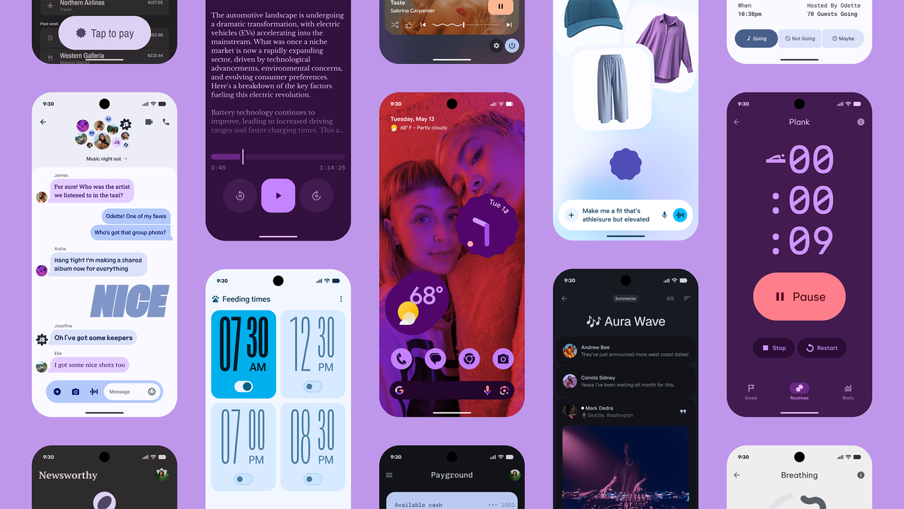
A Softer, More Dynamic Reboot: Google's Gradient and Material 3 Expressive
While Spotify went for shock value, Google executed a more calculated and systematic shift. In the same week, Google began rolling out a massive visual overhaul of its entire Workspace suite. The strict, flat, four color icons of Gmail, Drive, Calendar, and Docs were ditched for a new "gradient" style. The new icons have a softer, more dimensional feel, with colors blending into each other and lighting schemes that add a sense of glow.
This wasn't just a cosmetic tweak. According to reports, this shift is part of Google's Material 3 Expressive upgrade, which extends far beyond icons into the core of Android and the web. Material 3 Expressive is designed to make interfaces feel more "alive," utilizing deeper layers, bolder typography, and spring-like motion physics to indicate hierarchy. The new gradient icons, with their softer rounded corners and natural light transitions, are meant to reflect the "deep integration of AI-driven features" like Gemini across its ecosystem. This is Google acknowledging that a purely flat "tool" interface isn't enough when users are interacting with advanced, conversational AI.
It's a return to the original mission of "material" design: creating metaphorical paper that moves and provides tactile feedback.

The Rise of the Successors: A Fragmented Future
With flat design receding, the void is being filled by four distinct, competing trends, each with its own philosophy and tools.
1. Neo Skeuomorphism
This is the most direct counter to flat design. According to Userology, neo skeuomorphism is not a return to the glossy, fake leather of 2010. Instead, it is a "practical design evolution that reintroduces depth, tactility, and physical cues to make complex systems understandable again". It adds subtle elevation, soft shadows, and micro motion to clarify what is interactive. In user tests, participants consistently described these interfaces as "clearer" and more "confident". A report from Medium argues that flat design removed emotion, making everything look too predictable and boring. This trend is riding the wave of spatial computing, where interfaces are moving off the screen and into 3D space.
2. Neumorphism
You might have seen neumorphism on Dribbble before, often mocked as "Soft UI" for its low contrast. However, in 2026, it has matured from a trend into a tactic. It is no longer about dominating the screen with pillowy grey interfaces. A DesignRush guide states that in 2026, "it’s not a trend. It’s a tactic." Neumorphism now works best as a strategic accent to add warmth, tactility, and brand depth without sacrificing contrast or load speeds. It’s particularly effective in wellness, fintech, and premium SaaS brands where softness and calm are part of the brand voice.
3. Neo Brutalism
This is the rebel of the group. While AI generates perfect, polished visuals, designers are swinging the other way. Neo Brutalism is the human fingerprint. Expect to see raw HTML aesthetics, deliberately broken grids, monospace typography, high contrast, and visible borders. A post on Muzli notes that "retro is back, and brutalism never really left. It is louder, bolder, and prouder. It is the human fingerprint in a machine-generated world". It rejects the flawless perfection of AI-generated design for the messy, raw, and authentic.
4. Expressive 3D and WebGL
Thanks to powerful browser tools, 3D is no longer just a gimmick for portfolio sites. It is now a communication medium. Low cost frameworks like Spline and React Three Fiber allow designers to build 3D environments that move, tilt, and react to the user. The Network Solutions 2026 trend report highlights that "interactive 3D elements are among the latest UI/UX innovations that provide users with a more immersive browsing experience". It is particularly beneficial for ecommerce, allowing shoppers to explore products from multiple angles, and for data visualization, making complex information easier to digest.
Who is Behind the Shift?
The biggest name behind the shift is Google, through its rigorous research for Material 3 Expressive. The company admitted that "expressive interfaces" have the power to stir emotions, convey personality, and enhance usability. Their data showed that users identify key UI elements up to four times faster in expressive layouts. This is not a visual fad; it’s an evidence-based push towards interfaces that are both fun and functional.
Userology and independent researchers are also major drivers. They are providing the data that proves flat interfaces are failing UX. And of course, the designers and engineers at Spotify, who decided that a 20th birthday deserved a flashy, 3D party hat rather than a simple discount code or static badge.
The Future: A Hybrid, Intelligent Design Landscape
So, is flat design dead? No, but its dominance is. The era of "flat design as the only default" is over. In 2026, digital design is becoming hybrid. A website might use a flat layout for informational text (for speed and readability) while using 3D product carousels for ecommerce and neo skeuomorphic toggles for user settings.
The deep driver of this change is AI. As interfaces become more conversational, generative, and adaptive, static 2D screens fail to provide feedback. If an AI is dynamically generating a dashboard for you, you need visual depth to understand what's data, what's a button, and what's a suggestion. Flat interfaces will not survive in that cognitive load. The best design in 2026 won't be the flattest; it will be the one that makes intent obvious, actions clear, and systems trustworthy. It’s a brave new world of depth, emotion, and pixels that pop.
Need Help Navigating the Future of Web Design?
Design is moving fast, and keeping up with AI tools, new visual languages, and complex UX needs can be overwhelming for any business owner.
I am Sami Haraketi, a web designer with over 50 websites built and more than 10 sites actively managed daily. I take projects from zero to thousands of views. If you need a website that doesn't just look modern but actually converts—whether you're looking for a sleek, fast AI site or a design that incorporates the latest trends in depth and motion—I can help you cut through the noise and build a digital asset that works. You can visit my portfolio at samiharaketi.com or reach out to me directly to discuss your project.


More
more
like this
like this
On this blog, I write about what I love: AI, web design, graphic design, SEO, tech, and cinema, with a personal twist.